
Project Overview
Inkwell is a digital publishing platform exploring how readers discover written content and how creators publish and present their work through a unified web experience.
I’m Harshit Patel, a multidisciplinary designer focused on UI/UX, digital products, brand identity and visual communication.
I explore how people, interfaces, objects and visual systems connect — turning ideas into clear, meaningful experiences.
MULTIDISCIPLINARY DESIGNER
I'm Harshit Patel, a multidisciplinary designer working across UI/UX, digital product design, web experiences, brand identity and visual communication.
My strongest interest is user-centered digital design: understanding problems, organizing information and translating ideas into interfaces and experiences that are clear, usable and visually distinctive.
Alongside digital work, I explore branding, graphic design, sketching, form and physical experimentation. Working across these disciplines helps me approach design from both functional and visual perspectives.
Research / Observation / Problem definition / Information structure / Exploration / Iteration / Visual systems / Reflection
UX Research / Interaction Design / Product Thinking / Design Systems / Visual Communication / Creative Technology
Digital Publishing Platform
Digital Health Interface
Lifestyle Brand System
Café & Bakery Identity
Product & Material Exploration
Project 01 / UI/UX / PRODUCT DESIGN
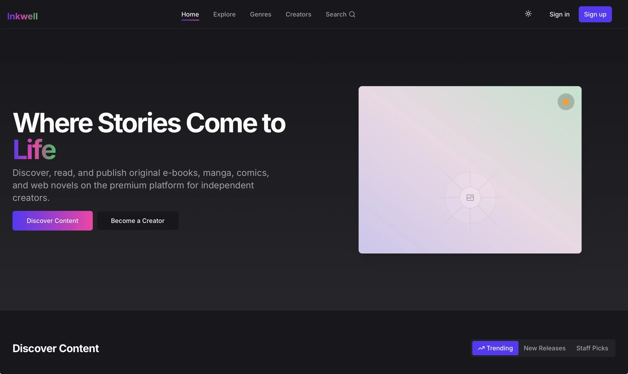
Inkwell is a digital publishing platform exploring how readers discover written content and how creators publish and present their work through a unified web experience.
Inkwell is a digital publishing platform exploring how readers discover written content and how creators publish and present their work through a unified web experience.
The supplied screenshot shows the implemented web interface. Explore the live product using the Visit live link.
Project 02 / UI/UX / PRODUCT DESIGN
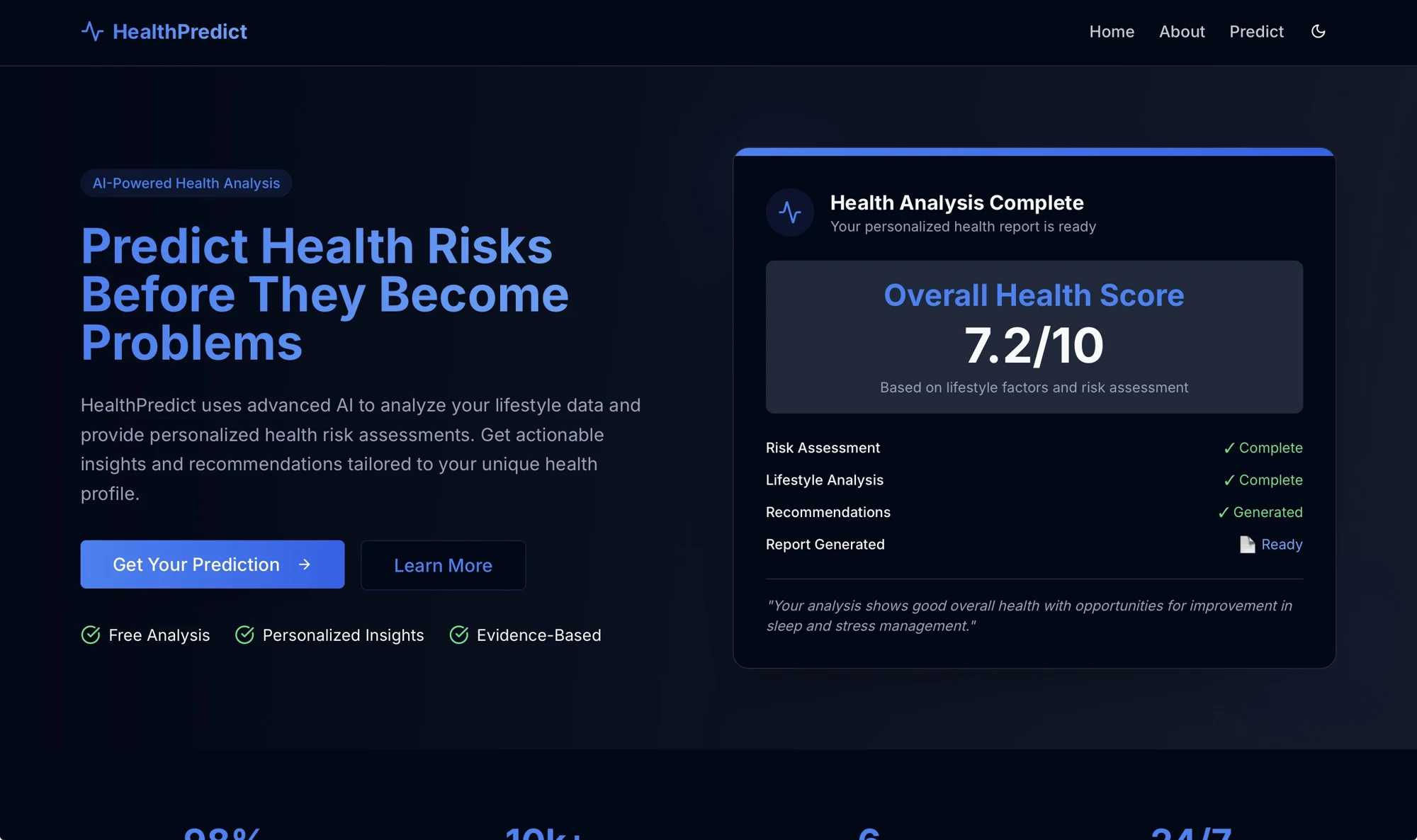
HealthPredict is a digital health interface exploring questionnaire flows, information hierarchy and the communication of results and recommendations. This case study focuses on interface design and usability, without making claims about diagnostic accuracy.
HealthPredict is a digital health interface exploring questionnaire flows, information hierarchy and the communication of results and recommendations. This case study focuses on interface design and usability, without making claims about diagnostic accuracy.
A digital health experience needs to make complex information understandable while communicating uncertainty responsibly.
The supplied screenshot shows the implemented web interface. Explore the live product using the Visit live link.
Project 03 / BRAND IDENTITY / BRAND SYSTEM
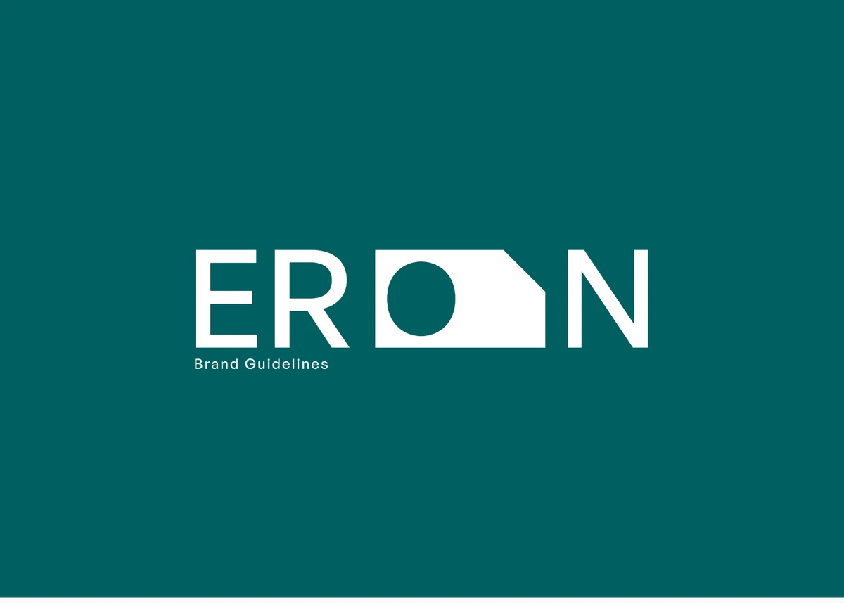
ERON is a design-driven lifestyle brand concept bringing electronics, furniture and everyday objects into one visual system built around clarity, balance and control.
ERON is a design-driven lifestyle brand concept bringing electronics, furniture and everyday objects into one visual system built around clarity, balance and control.
Clarity, balance, and control define how ERON approaches everyday objects and experiences.
The identity balances engineered precision with the softness of everyday living. Geometric structure anchors the wordmark; angular cuts express release, flow, and transformation.
The O explores energy, flow, and interaction. The geometric symbol expresses structure and engineered precision.
General Sans provides a geometric foundation while remaining approachable in everyday applications.
HEAT / #D35616 — thermal energy and activity. HOME / #005F61 — stability and everyday utility. LIVING / #3A5F7D — space and calm. Black and white unify the system.
Kitchen, home, and living translate one identity across different product contexts.
The supplied study shows the visual identity applied to product packaging across the brand’s categories.
Project 04 / PRODUCT / MATERIAL EXPLORATION
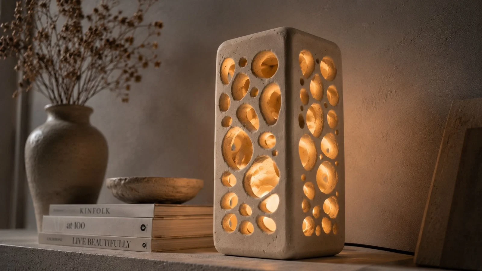
MRIDA is a sculptural lighting exploration inspired by erosion, stone cavities and organic surfaces. The project studies how light can emerge through imperfect carved forms.
MRIDA is a sculptural lighting exploration inspired by erosion, stone cavities and organic surfaces. The project studies how light can emerge through imperfect carved forms.
Natural erosion, stone cavities, coral structures, and porous rocks inform organic geometry and imperfect surfaces.
Solid mass and open cavities create a tension between architectural presence and soft illumination.
POP becomes a sculptural medium. Its surface and workability support an exploration of subtractive form.
Designed through subtraction. The supplied study documents carved cavities and textured forms.
Light emerges through openings and across porous surfaces, giving the object a changing presence.
A sculptural lighting object defined by its relationship between mass, cavity, surface, and light.
MRIDA is not designed to emit harsh illumination. Soft light reveals the form rather than overwhelming it.
Project 05 / BRAND IDENTITY
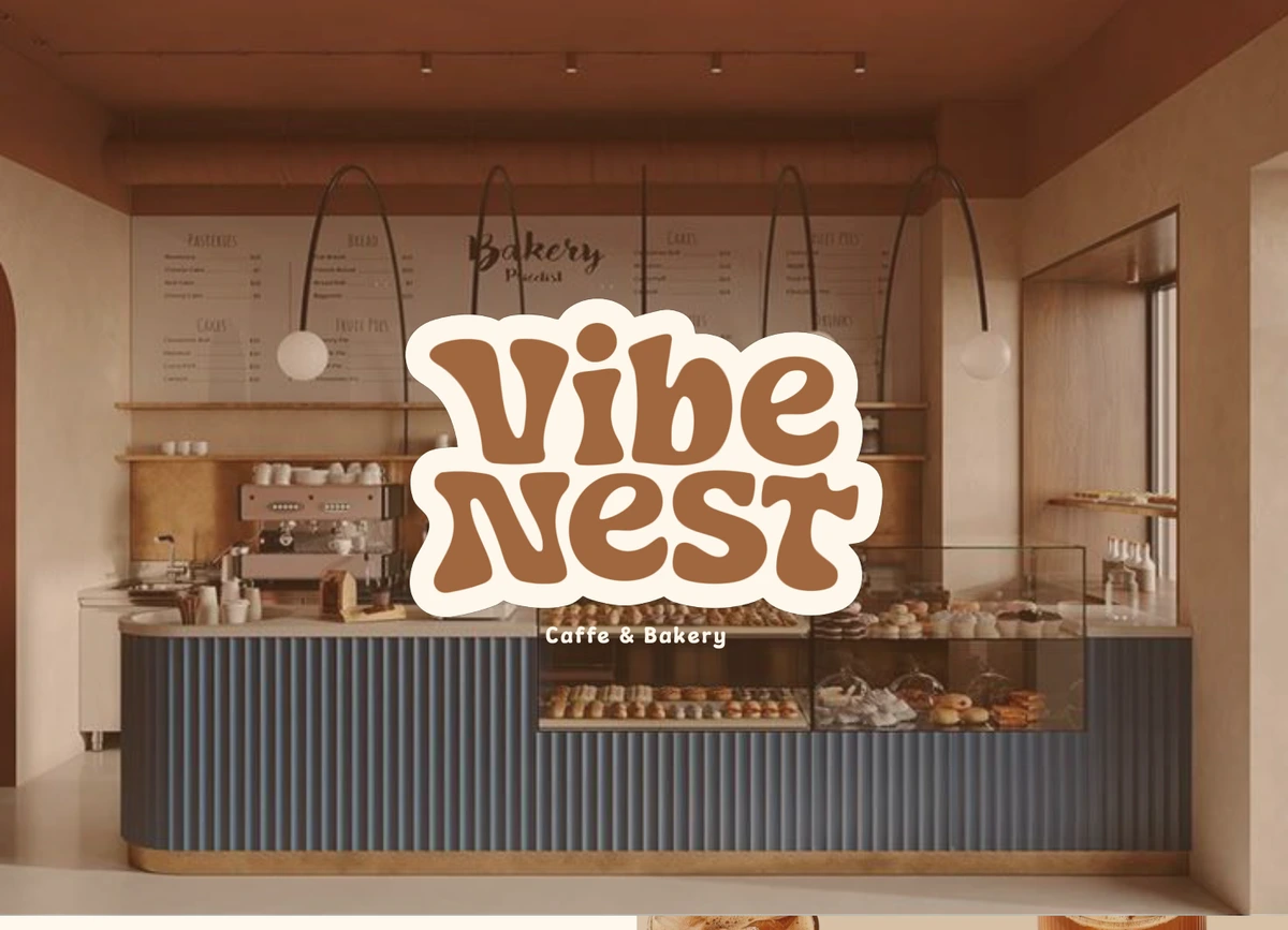
Vibe Nest is a café and bakery identity built around warmth, comfort and connection. Its visual system combines soft organic forms, rounded typography and earthy coffee-inspired colors.
Vibe Nest is a café and bakery identity built around warmth, comfort and connection. Its visual system combines soft organic forms, rounded typography and earthy coffee-inspired colors.
Retro typography and earthy coffee tones bring warmth and a relaxed café culture into the identity.
Soft, flowing letterforms and rounded shapes give the wordmark an approachable personality.
The supplied identity pairs expressive display typography with a supporting readable type system.
Baunilha Suave / #FFF8ED. Caramelo Torrado / #A1663D. Cafe Intenso / #3E2016.
Organic forms and warm tones carry the feeling of coffee, baked treats, and shared moments.
The supplied study extends the identity into cups, takeaway packaging, and bakery applications.
Signage and café mockups place the identity within a welcoming physical environment.
Typography, earthy colors, organic forms, packaging, and café applications work together as a warm and approachable identity.
Project 06 / SKETCHING / FORM EXPLORATION
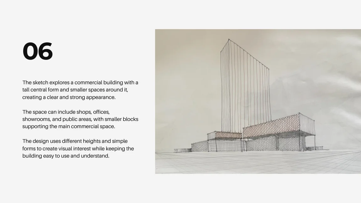
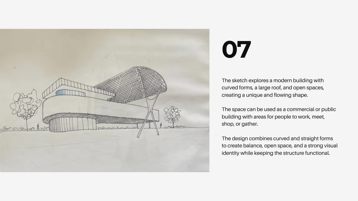
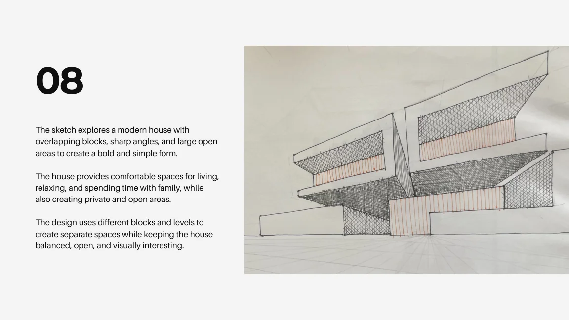
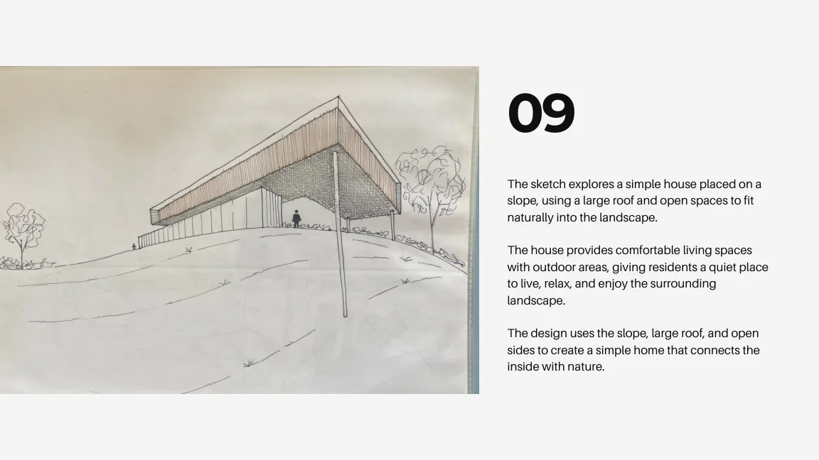
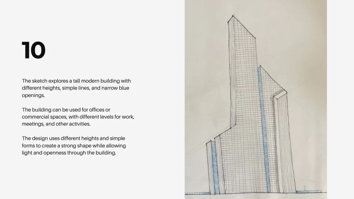
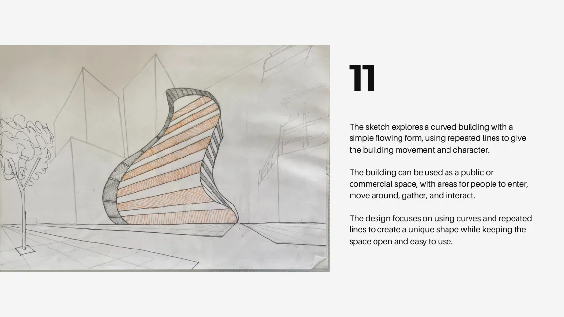
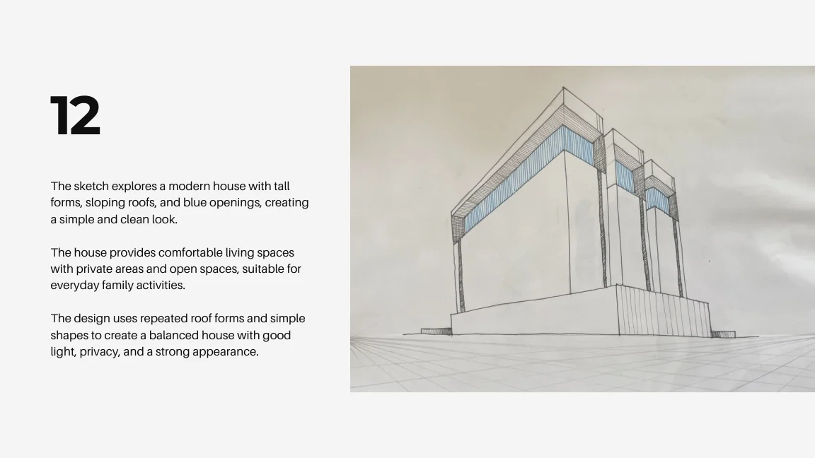
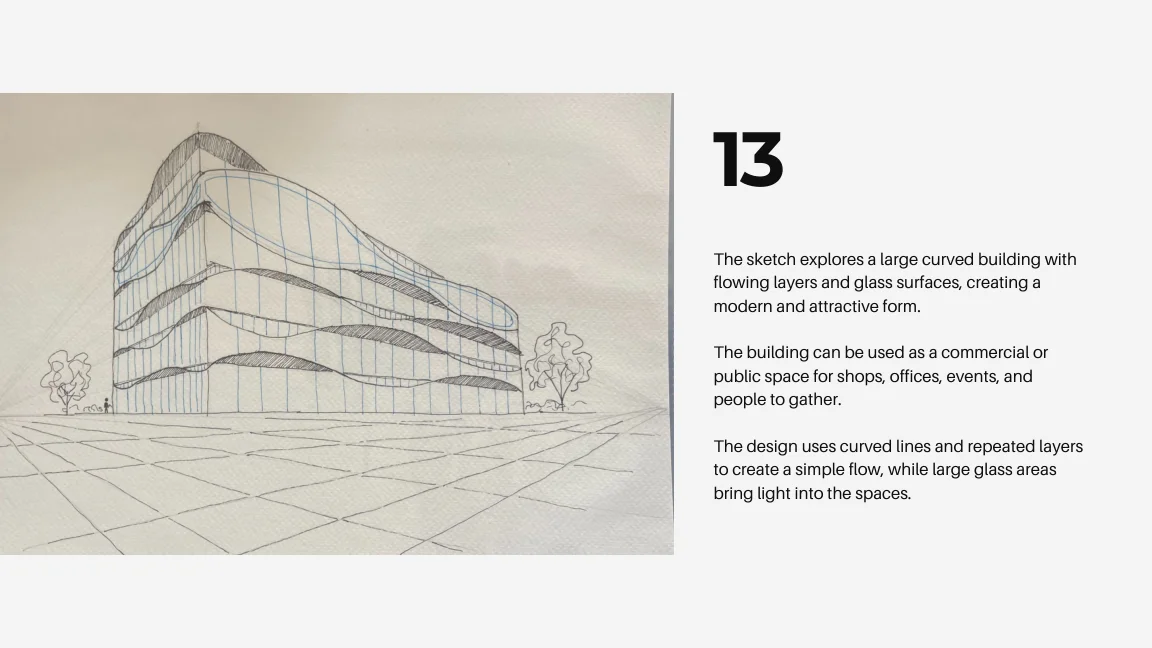
AKAR is a collection of architectural sketches exploring form, proportion, space, perspective and composition through early-stage visual studies.
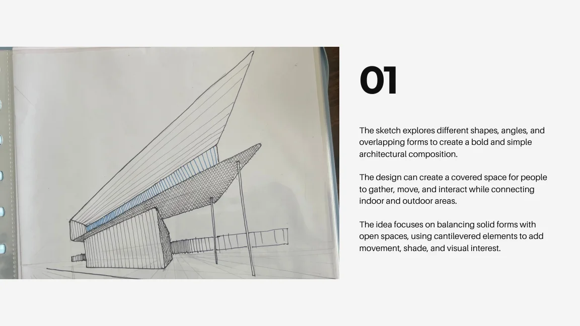
AKAR is a collection of architectural sketches exploring form, proportion, space, perspective and composition through early-stage visual studies.
Geometric volumes, curved structures, cantilevers, and overlapping forms test architectural composition.
Stacked blocks, cantilevered elements, and curved roofs explore the balance of solid volumes and open spaces.
Open and closed spaces investigate the relationship between indoor areas, outdoor areas, shade, and movement.
The sketches use perspective to investigate depth, proportion, and the relationship between architectural volumes.
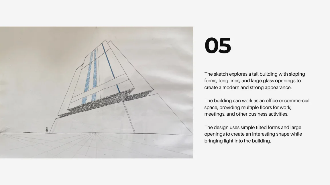
The drawings are presented sequentially, as evidence of observation and spatial thinking.
Project 07 / BRAND IDENTITY
Synergy Travel Nashik is a travel service brand identity exploring connected journeys, clear communication, and a cream, gold and dark bronze visual system.
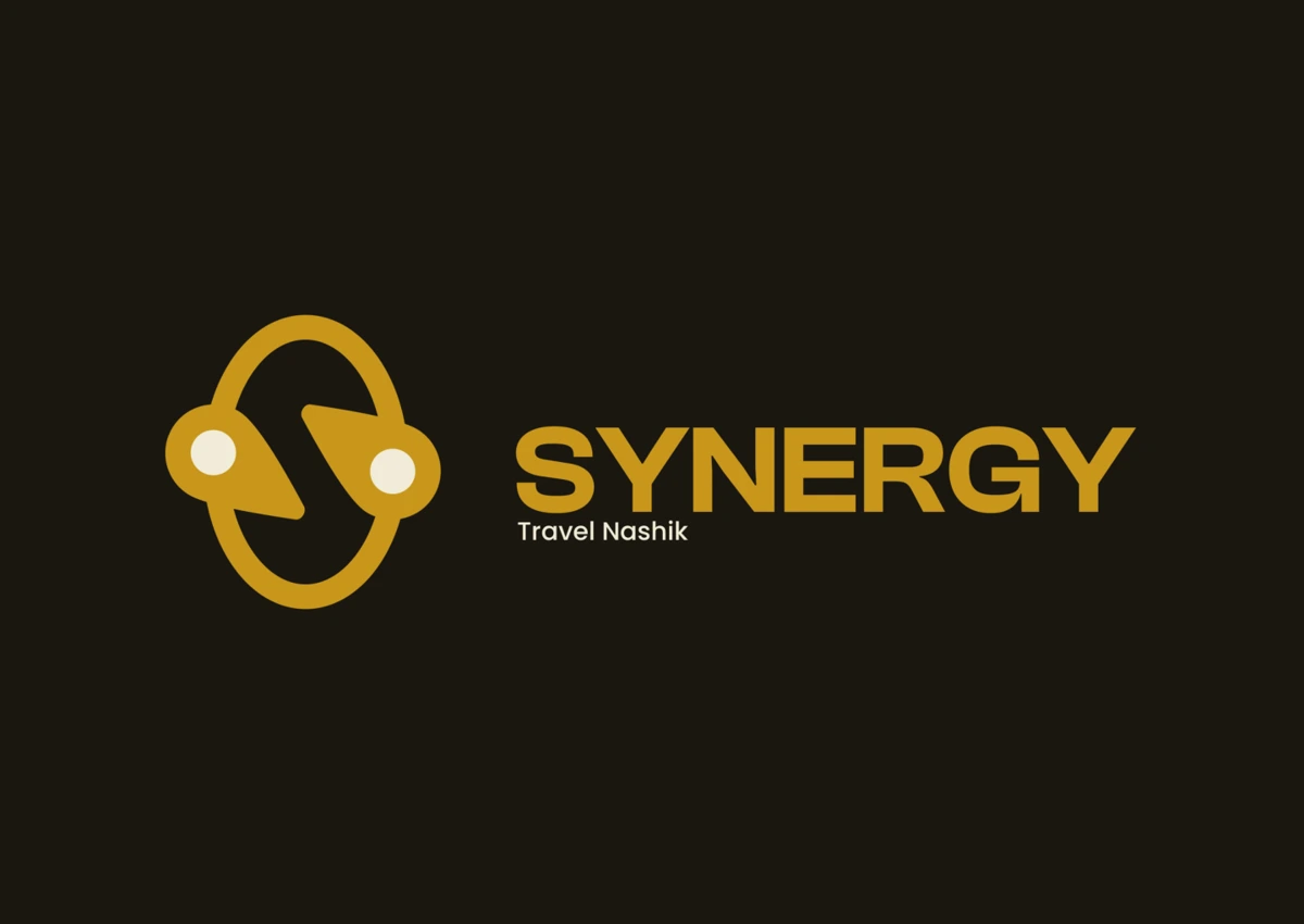
Synergy Travel Nashik is a cab and travel service brand built around smooth, dependable journeys.
The flowing symbol explores a travel route, the initial S, and connections between destinations.
The symbol and wordmark adapt across complete and compact versions of the identity.
A clear type system supports the expressive travel symbol and readable brand communication.
Cream, gold and dark bronze form the palette shown in the supplied identity study.
The supplied graphic applications extend the identity into travel and service communications.
The visual identity applied to vehicles, stationery, signage, uniforms and travel touchpoints.
Project 08 / BRAND IDENTITY
Rudra Energy Energy Solutions is a travel service brand identity exploring connected journeys, clear communication, and a cream, gold and dark bronze visual system.
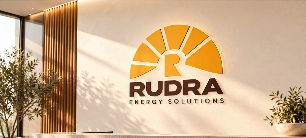
Rudra Energy Solutions brings a broad mix of energy services together under one recognisable identity centred on energy, strength and clarity.
Radiating energy. Grounded strength.
The symbol connects light and energy with R recognition and grounded strength.
The supplied study explores the complete wordmark, standalone symbol and a dark variation.
Warm Ivory / #F7F3EB. Rudra Brown / #3E2722. Energy Amber / #F7A91D.
Arial supports clear, approachable communication across the identity.
The identity extends into vehicles, uniforms, safety equipment, signage and stationery.
A collection of graphic experiments, posters, album artwork, packaging, thumbnails and visual studies. Open a file to view the full artwork and move through the archive.
PERSONAL PHOTOGRAPHY / 20 FRAMES
A personal collection of light, places and everyday moments.
Notes on visual design, interfaces and the creative process.
Published on LinkedIn.
Have a project, a collaboration or an opportunity in mind? Tell me what you’re thinking. We can work out where design can help.
START A CONVERSATION ↗A short introduction is enough to get started. Useful details include: